ShopDreamUp AI ArtDreamUp

Deviation Actions
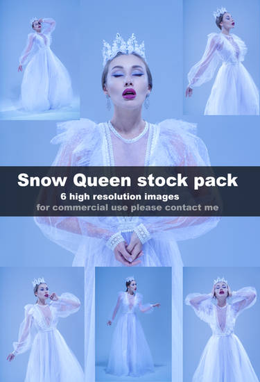


Description
Model: Anastasia
MUA & Hair: Anna Kravchenko
Assistant: Inna Kikhtenko
Stock: DreamsTime / Shutterstock / DepositePhotos / Fotolia / IStock / 123RF
:origin()/pre02/76d9/th/pre/f/2014/262/4/3/milana_in_black_lingerie_3344_by_flexdreams-d7zr3u2.jpg)
:origin()/pre14/7228/th/pre/f/2014/327/7/8/moon_sentinel_2_by_bigbad_red-d87dp06.jpg)
:origin()/pre00/f33a/th/pre/f/2014/267/a/b/tatyana_in_warm_lingerie_by_flexdreams-d80dhhg.jpg)
:origin()/pre02/4985/th/pre/f/2009/335/9/4/flimsy_menace_by_flex_flex.jpg)
:origin()/pre11/6693/th/pre/f/2014/021/3/5/chill_by_bigbad_red-d733ire.jpg)
:origin()/pre12/7ba4/th/pre/f/2014/246/5/8/marina_in_black_lingerie_by_flexdreams-d7xt3bi.jpg)
www.FlexDreams.com
MUA & Hair: Anna Kravchenko
Assistant: Inna Kikhtenko
Stock: DreamsTime / Shutterstock / DepositePhotos / Fotolia / IStock / 123RF
www.FlexDreams.com
Image size
529x800px 127.71 KB
Make
PENTAX
Model
PENTAX K-5
Shutter Speed
1/180 second
Aperture
F/5.6
Focal Length
77 mm
ISO Speed
80
Date Taken
Aug 28, 2014, 7:41:56 PM
© 2015 - 2024 FlexDreams
Comments6
Join the community to add your comment. Already a deviant? Log In
Let me begin by saying that I think this is a beautiful shot of a beautiful model. But I think you already knew that, so let's get technical. <img src="e.deviantart.net/emoticons/s/s…" width="15" height="15" alt="
The lighting scheme you've used here creates shadows that are extremely evocative. And also takes full advantage of her pristine skin. She almost looks like she's made of porcelain here. Absolutely great. I also really enjoy the way her hair stands out so starkly against the otherwise almost desaturated monochrome of the photo.
Her facial expression draws me in. I am left wondering whether or not she's lost in thought, or dazed. Very nice. There's an ethereal quality to it which I think it very well done.
My one point of criticism would be that I think a little more tension in her body would've added another layer to photo. If perhaps she had arched her back just slightly, I think it would've created an even more interesting line. I don't mean - GQ Men's Magazine style - push out her chest. But she has such a lovely frame, I think it would've been great to just make full use of it. As it is the placement of her arms maker her look very straight up and down.
But as I said at the beginning: Great Job!