ShopDreamUp AI ArtDreamUp
Deviation Actions


Description
Model: Alyona
MUA: Alexandra Shtein
Hair: Alyona Karabash
Assistant: Inna Kikhtenko
Retouch:
Stock: DreamsTime / Shutterstock / DepositePhotos / Fotolia / IStock / 123RF
www.FlexDreams.com
MUA: Alexandra Shtein
Hair: Alyona Karabash
Assistant: Inna Kikhtenko
Retouch:
Stock: DreamsTime / Shutterstock / DepositePhotos / Fotolia / IStock / 123RF
:origin()/pre15/758d/th/pre/f/2014/263/4/f/ablution_i_by_flexdreams-d7zua0m.jpg)
:origin()/pre14/5581/th/pre/f/2014/263/2/7/necrosis_by_flexdreams-d7zu6vz.jpg)
:origin()/pre11/4cd5/th/pre/i/2009/227/6/1/bite_me_by_red_riding.jpg)
:origin()/pre05/c860/th/pre/f/2014/237/7/3/torpor_ii_by_flexdreams-d7wlhp6.jpg)
:origin()/pre04/8127/th/pre/f/2009/234/e/f/the_little_mermaid_by_red_riding.jpg)
:origin()/pre05/0320/th/pre/f/2012/237/0/7/gothic_rose_by_flexdreams-d5cc38v.jpg)
www.FlexDreams.com
Image size
511x800px 163.43 KB
Make
PENTAX
Model
PENTAX K-5
Shutter Speed
1/180 second
Aperture
F/5.0
Focal Length
31 mm
ISO Speed
80
Date Taken
Aug 14, 2014, 7:33:14 PM
© 2014 - 2024 FlexDreams
Comments13
Join the community to add your comment. Already a deviant? Log In
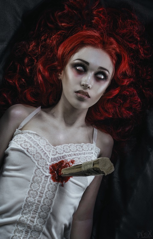
I would like to address your three works in this series as they tell a story to me. First off, I like the fact that each of the three views has the viewer approaching closer and closer to the vampire. This not only mimics the action of the slayer, but draws the viewer into the action.
Second, the coloration is appropriately eerie, with the shading of her skin tone, and the sparing use of red done to good effect. I like the way her hair pops against the background without taking over the picture, as could have happened all to easily. It reminds me off flickering flames. Her hair trails off into nothingness just as flames do as they rise from a fire and dissipate into space. The fact that the red highlights of her hair are not all connected is what does this for me. Even the layout of her hair contributes to this. In Aspen Stake I, her hair is the most spread out - the fire is blazing. In AS II, it is drawn in somewhat, and in AS III, it looks as though the fire is dying. (Note: the effect of getting closer to the vampire in each picture, and the hair effect that I described is easier to see when you reverse AS I so that the orientation of the vampire is the same as in AS II and AS III. Certainly the slayer might approach from the direction indicated in AS I, but I reversed it to aid in comparing the three pieces.)
As the vampire is thin, the minimal blood stain is good. Aside from not overpowering the rest of the picture (less is more) it is in keeping with her very thin appearance, as though she might not have fed in some time. And the blood stain connects us back up to her hair. The red at the bottom of her eyes in AS III is also a nice touch. It made me think of the fact that blood will tend to seek the lowest part of a dead body.
One thing I did have a problem with was her neck. In AS I and AS III, she should be relaxed, while in AS II she is tense. Yet in all three, her neck appears to be flexed. Was this because of the way her head was or was not supported as she was laying down? Granted that one would expect to see some hollowing in the center of her throat, due to her thin build, but it appeared to me as though she were tense in all three. If the angle of her head was necessary for lighting or posing purposes, I can understand that. I was just describing the discord it brought up for me.
In AS II, the blurred hand, arm and stake is good, showing action. I'm curious as to whether this was due to actual motion, or the result of the field of view from the camera settings, or some later photomanipulation. In any event, the end result was good. As it is blurred, our focus remains where it should be, on her. Plus, it makes the whole scene more urgent for the viewer, caught in the middle of the action as we are.
Speaking of the stake, having the twine wrapped around the part that was being gripped by the slayer was an excellent detail. It prevents slippage of the hand, as well as the odd splinter. Such attention to detail is to be commended. However, the length of the stake as seen in AS II appears too short to be the same one in AS III, unless it hasn't penetrated very deeply into our poor vampire. I can see the start of the tapering, so I think it may be more of a case of the stake not being in as far as one would expect.
And finally, I loved her gown. The lacework along the top, and down the middle (and, I think, along the bottom as seen in AS I) is timeless. It looks old, but it could also be new. This timelessness matches the nature of the vampire, and the battle against the evil they represent (my somewhat tongue in cheek comment on AS III notwithstanding).
So, two minor quibbles, but a superb series, each of which could stand on its own, but together tell the story very well indeed. Bravo.